6 Tips to Create an Effective Landing Page [Examples Inside]
Landing pages are an inevitable part of any inbound marketing strategy. When done well, they can convert traffic, both existing and cold, into valuable leads and boost your bottom-line results.
Well, if you promote any sort of product via media buying, then you certainly know the need for a high-converting landing page.
However, creating user-friendly and compelling landing pages that convert, requires adding up some essential ingredients. Fear not, in this blog, we will cover the essentials of an effective landing page.
Avoid ‘mismatch message’
How many times have you clicked on an ad banner only to realize that something entirely different than what was promised? Chances are, you must have come across such promotional offers many times that show a particular product in the headline, and after reaching the landing page, you realize it wasn’t the same message that made you click in the first place.
This is referred to as ‘message mismatch,’ and it often (almost always) turns away users:

To turn your leads into conversions, you need to build the trust of your potential customers. For achieving this, your landing page needs to have consistency. Make sure your landing page CTA button shows the same product that was mentioned in your headline. This lends credibility and adds to the trustworthiness of your landing page.
Remember any kind of message mismatch can dramatically affect your conversions.
Read more:

Placement of CTA
Call-to-action (CTA) is a crucial component of your landing page. Now the question arises whether you should place it above the fold or below the fold? Let’s take a deeper dive into this and know which option you should pick for your landing page.
- Above the fold – Placing the CTA above the fold is the most common placement choice of marketers. It saves users from scrolling down till the end to find what the offer is all about and catches the attention of the users right away.

Image source: https://cocovillage.com/
However, the drawback with placing your CTA button above the fold is like hitting someone right on their face before they get a chance to engage with your main message.
- Below the fold – Placing the CTA button below the fold is also emerging as a popular option for marketers. Thanks to sites like Facebook, lazy scrolling has become a regular feature of websites and is accepted by users as well. So, when you place your CTA below the fold on your landing page, you get enough space to share your marketing story, followed by your main marketing message, and then tie it together to your CTA.

Source: a survey in the PropellerAds Telegram Chat
The good part of placing your message below the fold is that your prospects gradually progress to your marketing story. However, if the content is not well presented, a visitor may bounce back before they reach the bottom of the page.
CTA is your last opportunity to turn your visitors into conversions; whether you should place it above the fold or below the fold depends upon the complexity of your offer or message. If you go with above the fold, then present all essential elements of your landing page in a block of content above the fold. And if you chose below the fold option, then present your information in a concise yet effective way without causing any distraction.
Content on your landing page
Providing relevant content in the most convincing and succinct way is key for marketers. Your visitors are not interested in knowing the features of your products rather, they want to know how using your particular product or service can solve their problem or provide a solution to their pain points.
A copy of your content needs to be presented in a clear way so that visitors don’t need to struggle to find out the main offering. It needs to be convincing and compelling and should convey to your audience right from the headline what’s in it for them. To improve the efficacy of your content copy and to grab the attention of your audience right away, you can always use words ‘free’ and ‘you.’ These are powerful words and rarely fail to excite prospects.
Landing Page Design
The overall aesthetic feel of your landing page design is important when it comes to the efficacy of your landing page. Here are some essential ingredients for making your landing page more user-friendly.
- Keep the design of your landing page simple with a clean layout.
- Break the content into bullet points for easy reading.

Image source: https://seen.com/the-app
- Use eye-catching images, but avoid adding too many images as it may look like visual clutter.
- You can also add a short video showing how your product or service addresses their needs, problems, or interests.

Image source: https://www.arrivesafe.app/
- Heading that grabs attention immediately and conveys your marketing message effortlessly.

Image source: https://www.opal.so/
- Choose the right color scheme to improve the overall appeal of your landing page design.
- Call-to-action needs to be clear, concise, and compelling.

Source: a survey in the PropellerAds Telegram Chat
Most importantly, use a lot of whitespace to give your landing page a de-cluttered look.
Consistency in Display Advertising
Your visitors first see the display ads before they reach your landing page. Keeping a similar flow of your ad and landing page is vital to create familiarity, else visitors may feela little disconnected.
You can achieve this consistency by keeping your creatives of both matched with each other as closely as possible. Here are some quick tips for this:
- Keep the same color scheme for both your landing page and banner ad.
- The image on the banner ad and landing page should be the same. You can use many other images on your landing page, but keep the hero image (main image) the same.
- Keep the main offer, marketing message, and any kind of discounts shown or pricing the same.
For example, if you have an ad banner that says ‘Avail 20% discount on $860 Surf Lessons’, then keep the headline on your landing page the same.

Source: a survey in the PropellerAds Telegram Chat
Adding social proof to your landing page is a good way to boost your conversions. You can always embed tweets or comments, or videos from users who have said good things about your company.

Example source: https://celimax.us/
It adds to your credibility and builds up trust instantly, resulting in increased conversions.
Bonus tip
Logo helps people recognize the business, and it is especially important in case when visitors are reaching your landing page from any external sources, such as social media, PPC, and search.
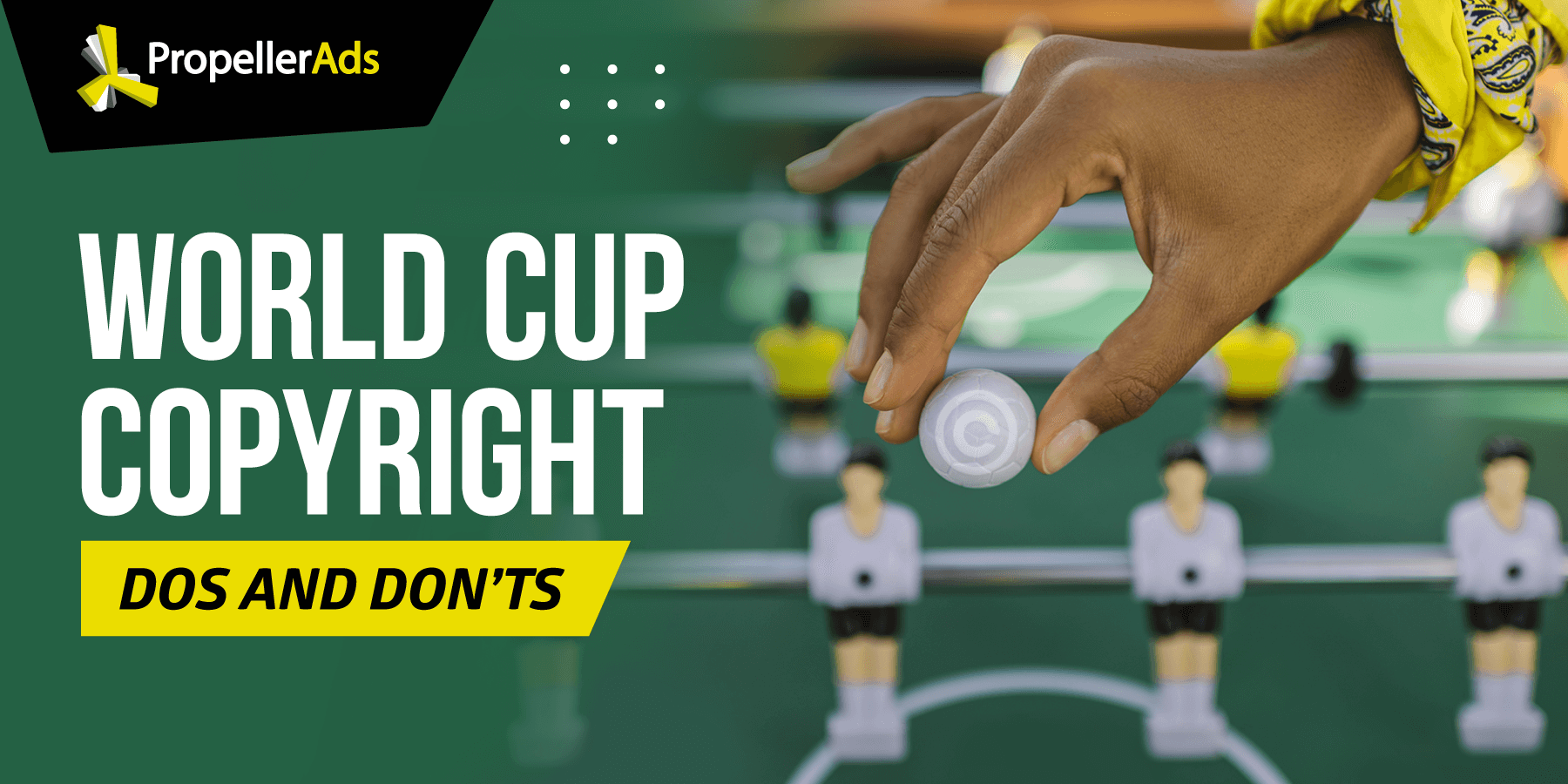
However, make sure you don’t use logos that don’t belong to you.
For example, if you promote an iGaming offer related to a major event like FIFA, you can’t use the FIFA logo unless you are officially authorized to do so. The same rule applies if you’re a media buyer – your team’s logo is not really a good idea when you’re advertising a third-party product.
Final Words
Creating persuasive, powerful, and user-friendly landing pages that convert is a key thing for marketers to master. Implement the said expert tips on your landing page, and it will surely help you in engaging your audience, increasing your earnings, and dramatically increasing your landing page conversion rate.
Join our Telegram for more insights and share your ideas with fellow-affiliates!